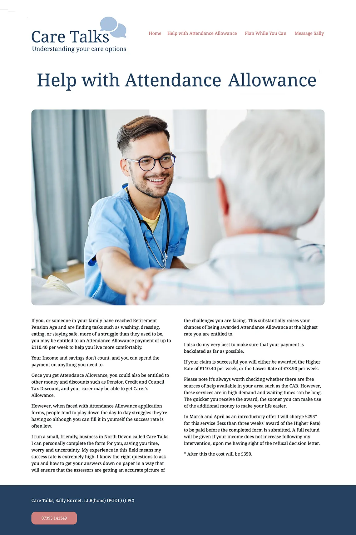
An example of web design
Care Talks
Care Talks is a highly personal service, and the website reflects that from the first interaction. The primary job of the site is to reassure people who are often anxious, uncertain, and under pressure. Everything about the structure and content supports that aim.
The opening content is calm, direct, and human. It clearly explains who the service is for, what Sally Burnet does, and when it’s most useful to seek help. There’s no attempt to oversimplify a complex subject, and no unnecessary jargon. Visitors are guided gently through unfamiliar territory, which helps reduce fear.
One of the strongest elements of the site is the decision to foreground Sally herself. Including a clear, honest photograph of the owner signals confidence and accountability. On a service built on trust, this matters. It says: this is a real person, with real experience, standing behind the work.
The long testimonials are another notable strength. While we often advise caution with carousels, this is a good example of using them thoughtfully. The scrolling is user-controlled, allowing people to read at their own pace. The length of the testimonials works in the site’s favour. Many are written by professionals and practitioners, adding weight and credibility.
Visually, the design is calm and approachable, using soft colour blocks and generous spacing to separate ideas clearly. Content is easy to scan and never feels rushed. Navigation is simple and predictable, helping visitors focus on understanding their options.
Overall, Care Talks works because it respects its audience. It prioritises clarity, trust, and emotional reassurance, allowing people to engage with difficult decisions in a way that feels supported.