Judging a book by its cover
How Penguin Books has used design to appeal to new generations of readers for 75 years
Stacey Sheppard looks at how Penguin Books has used design to appeal to readers for 75 years and concludes that we really do judge a book by its cover.

It was the summer of 1935 when Penguin books first appeared – changing the UK publishing industry thanks to the ideas of publisher Allen Lane. And the story actually began right here in Devon only 12 miles from the We Make Media HQ. Lane had spent a weekend at Greenway, the Devon home of the crime writer Agatha Christie, and was frustrated on his return journey to London when he was unable to find something to read at Exeter station other than reprints of 19th-century novels. It was at that moment that he decided to found a publishing house to produce good-quality paperbacks sold at only sixpence each.
Since 1935 each Penguin book cover has perfectly captured the culture of its time and Penguin has forged for itself an important place in Britain’s design history owing to its progressive approach to typography and cover design. The emergence of graphic design as a profession, along with the wealth of talented and creative designers who have worked at Penguin over the years, ensured that Penguin became an exemplar of book design.

In the early days, Lane insisted that all books followed a rigorous application of colour, grid and typography. Each genre was allocated its own colour: orange for fiction, green for crime and blue for biography. This commitment to design was further strengthened under the direction of German typographer Jan Tschichold in the 1940s.
He designed a template to be used for all Penguin books with designated positions for the title and author’s name with a line between the two. He also unified the design of the front, the back and the spine and redrew the Penguin symbol in eight different variations. This strict design ethos ensured that the same style was always applied.
Tschichold’s successor, the typographer Hans Schmoller, did little to advance the design of Penguin covers and worked mostly with Tschichold’s existing templates. Just as Penguin appeared to be losing its edge, the company appointed the Italian art director Germano Facetti who was, in 1961, charged with reinvigorating Penguin’s design tradition. London’s fledgling graphic design scene was just starting to take off at this time and Facetti realised that the key to Penguin’s success lay in the new design talent that was pouring into the capital.
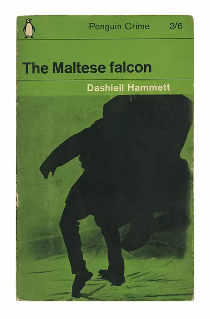
Facetti started by hiring Polish-born designer Romek Marber to redesign the crime series. The changes, which included a new grid that later became known as the Marber Grid, proved so successful that they were later rolled out across the other Penguin series. By the time Facetti left Penguin in 1972 he had revitalised and modernised the publisher's approach to design and had succeeded in doing so across hundreds of titles.
Today, it is Art Directors Jim Stoddart and John Hamilton who are responsible for the design direction of the company. Together they have a profound understanding of the needs of the publishing industry in a new digital world in which consumers are ever more demanding. The designers at Penguin are given the freedom to explore the full range of their capabilities and are encouraged to try the unexpected.
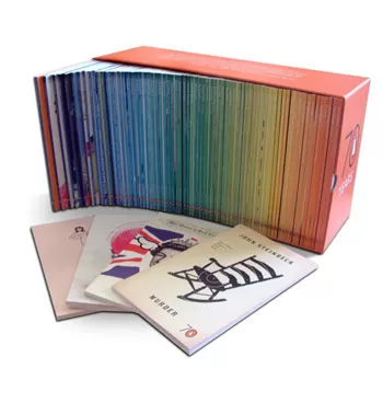
For example, in 2005 when Penguin celebrated its 70th anniversary by publishing a collection of 70 Pocket Penguins paperbacks, Stoddard and Hamilton were chosen to oversee the project. It was Hamilton who suggested the idea of inviting 70 designers, artists and illustrators to create one cover each in just seven days for a flat fee of £70. Luckily, all those the pair approached agreed and the collection today represents a panorama of contemporary graphic design and illustration.
Five years later, to celebrate its 75th birthday, Penguin published Penguin Decades, a collection that featured some classic books published in Britain throughout '50s, '60s, '70s and '80s. For the covers, original designs were commissioned from four of today's most renowned designers: Peter Blake, Zandra Rhodes, Alan Aldridge and John Squires.

Today, Penguin continues to innovate with its approach to cover design. When the company decided to reinvent the Penguin Essentials range, which launched in April 2011, Senior Designer Richard Bravery took a unique approach and commissioned a variety of international artists and designers who had never worked in publishing in the traditional sense before, including tattoo and graffiti artists, paper sculptors and gig poster designers.
In an age where consumers are seeking to personalise everything they own, Penguin stepped up their game in launching My Penguin, an initiative whereby books are printed with naked front covers allowing readers to design their own masterpieces. The company also asked well-known bands and musicians which of their favourite Penguin Classics they would like to see naked and then asked them to design their own cover.
In the US, Penguin’s long-time Art Director Paul Buckley is also flexing his creative muscles. For the 75th anniversary he commissioned the Penguin Ink series, whereby he chose six books and presented them with new covers specially designed by some of the world's best artists working in the world of tattoos and illustration.

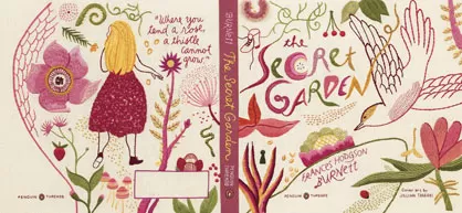
His next innovative project is entitled Penguin Threads and sees book covers created by talented people who sew, knit, embroider and crochet. The first three books in the series – Emma, Black Beauty and The Secret Garden – were created by illustrator and cartoonist Jillian Tamaki.
Year on year we see Penguin upping its game in the innovation stakes as the publisher seeks to find new ways to make its books appeal to new generations of readers. Penguin’s next move is yet to be revealed, but judging by past experience, whatever direction it takes will be an interesting one for us to watch.
All images courtesy of Penguin unless otherwise stated.
Stacey Sheppard. 14 July 2011
Receive more free advice in your inbox
Fill out this form for monthly articles about design, publishing and marketing for small businesses.